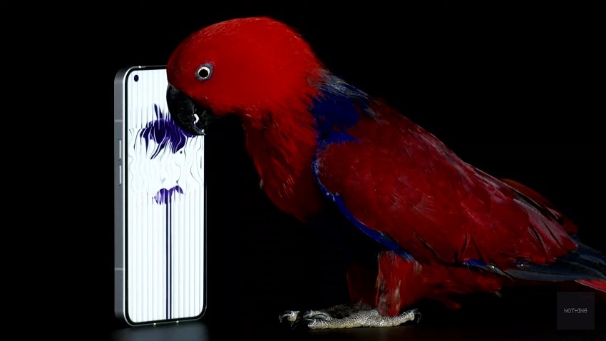
This year’s Nothing Phone 1 made a good impression and it created so much hype it polarized the entire tech industry. However, there is a need to catch up on a few points.
I know I’m a little late to the party. But I still won’t miss a detailed review of the Nothing Phone 1, not with this smartphone! Because when the co-founder of OnePlus brings a new smartphone onto the market, I prick my ears. Carl Pei chose a difficult field for the release. The Nothing Phone 1 faces stiff competition with the Pixel 6a, which was released in the same month.
What does The Nothing Phone 1 Do?
The Nothing Phone 1 does a lot of things right and knows how to please gadget lovers. Thanks to the Glyph interface, a mid-range smartphone gets an exciting and unique feature again after a long time.
However, due to the price of $469, the device has to put up with the comparison to the competition. Especially in the area of the camera, Nothing still has some catching up to do, although it can surprise positively in the test. The Nothing OS software could do with further fine-tuning, although it is close to stock Android, still has small stutters and bugs. As a total package, the Phone 1 from Nothing is definitely recommendable.

Design And Processing
The smartphone comes in unusual packaging that has been tailored to the rest of the device. In addition to the phone, a cable USB-C and a detailed SIM picker are included. The manufacturer almost completely dispenses with plastic here, which is very commendable.
As soon as I take the smartphone out of the packaging and pick it up, I notice: chic! The phone feels very good and is of high quality. For one or the other, the form factor might be a bit too angular and big, but it’s perfect for my medium-sized hands. At 193 grams, my new hand flatterer is sufficiently light and only slightly narrower than the 238-gram iPhone 13 Pro Max.
When the 6.5-inch display is switched on, the connection to the newer iPhone models quickly becomes clear to me. After all, this is one of the more common criticisms the Nothing Phone 1 has to listen to. The display edges are symmetrical and with the gesture control of Android 12, it almost looks like an iPhone 14 or iPhone 13.
However, I don’t find this point tragic, on the contrary: I actually like it very much! Because with the fine punch-hole camera in the top left, it looks very tidy to me. Of course, this is purely a matter of taste and there are Android devices out there that define themselves differently without resembling an apple. But the Nothing Phone 1 also knows how to stand out, but more on that later.
The display is surrounded by a matt and angular aluminum frame made from 100 percent recycled material. If you turn the smartphone, the dual camera is reminiscent of an iPhone. The transparent back made of Gorilla Glass 5 really appeals to me. The only criticism I would like to make at this point is the lack of the current Gorilla Glass Victus.
In contrast to typical flagships, the Nothing Phone does not offer an IP68 certification, which means: Complete protection against dust and permanent immersion for 30 minutes at a depth of 1.5 meters. However, the device is at least IP53 certified.

Why The Nothing Phone 1 All Hyped
Rarely does a single smartphone polarize the industry so much and cause a lot of explosives. But how did it even come about?
Let us briefly recall the early days of OnePlus. If you wanted to get hold of this insider tip at the time, you first had to be authorized via OnePlus’ Invite system. The purchase could then be completed via the official website. Sound crazy? – It was! However, this also provided a charming sense of exclusivity.
This should now be repeated with the Nothing Phone (1). However, the company behind Carl Pei went one step further this time. Before the device appears, according to its maker’s statements, Nothing Phone 1 was very connected to the community and gave fans the chance to hold the device in their hands earlier.
Similar to OnePlus, there was an invite system that gave buyers a code. Interested parties had to put themselves on a waiting list. In order to move up the rankings, the company had come up with a special marketing trick: Anyone who shared the recommendation link with their circle of acquaintances increased their own chance of getting a code in a timely manner.
The invites went out to the buyers by July 11th. Within 48 hours, the chosen ones had to pay a deposit of $20, which was not refunded if the buyer changed their mind. Tricky here: The exact prices were only announced on July 12th. On this date, the private links were also sent out to the waiting interested parties to finally order the device.
On top of everything, the phone’s unique characteristics including the display and the back, make people crazy about the new gadget. With the price range, users were getting something really slick and beautiful.
